REIMAGINING A WELL-ESTABLISHED BRAND FOR
EUGENE ELECTRIC
MODERNIZING A LEGACY BRAND
Building on four decades of expertise in adhesive tapes and structural materials, Eugene Electric partnered with CRE8 to redefine its brand identity, expressed through EUGENE, and support its global growth. With an expanding product portfolio, including materials supply, machinery sales, tape punching, and immersion cooling solutions, the brand required a visual system that honors its heritage while reflecting its ambitions. CRE8’s work spanned a logo redesign, new product development, and UI design, establishing a cohesive identity.
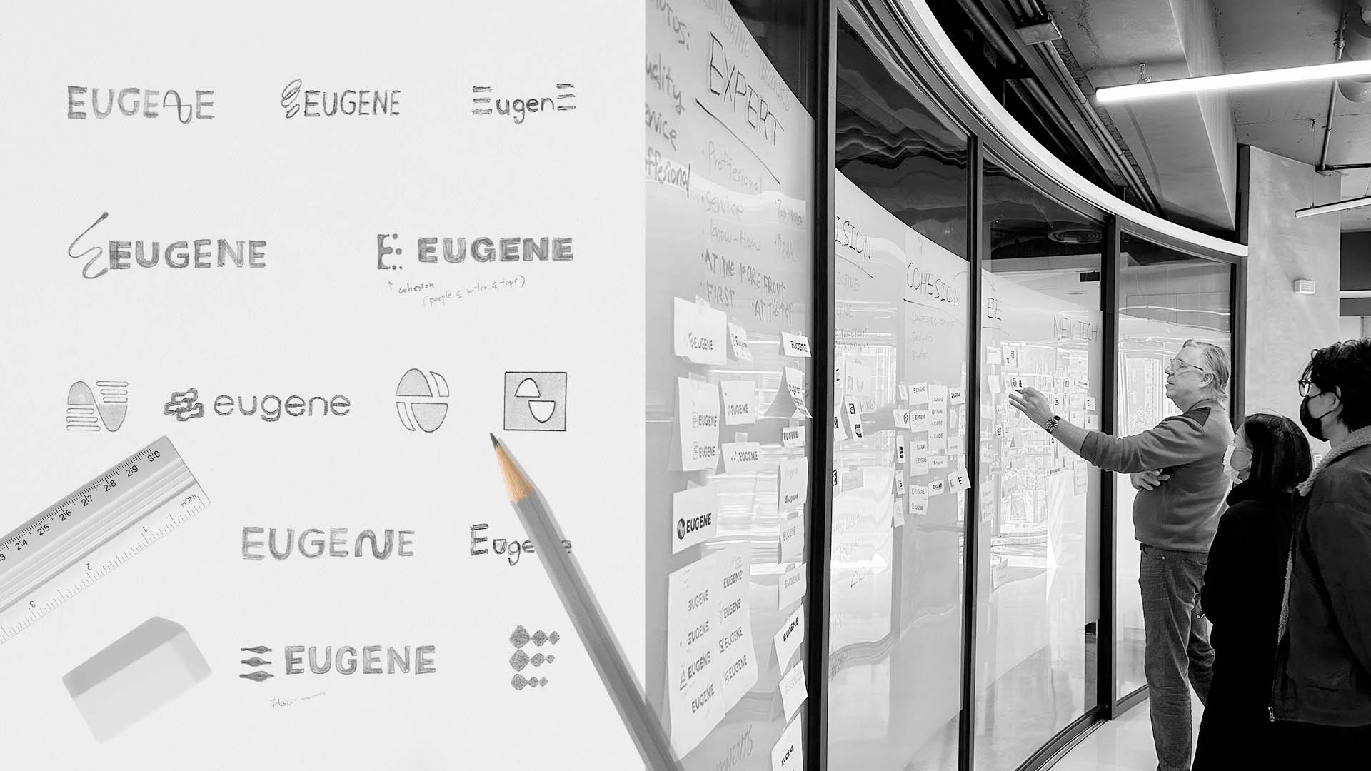
LOGO REDESIGN & EVOLUTION
The new logo balances EUGENE’s long-standing legacy with its forward-looking ambitions. While maintaining strong brand recognition, the refreshed identity highlights the brand’s core values of quality, service, and professionalism. As EUGENE expands its business into new sectors such as immersion cooling and enters international markets in Europe and North America, the updated logo reflects a brand that seamlessly integrates innovation, reliability, and decades of trusted industry experience.
VISUAL LANGUAGE IN MOTION
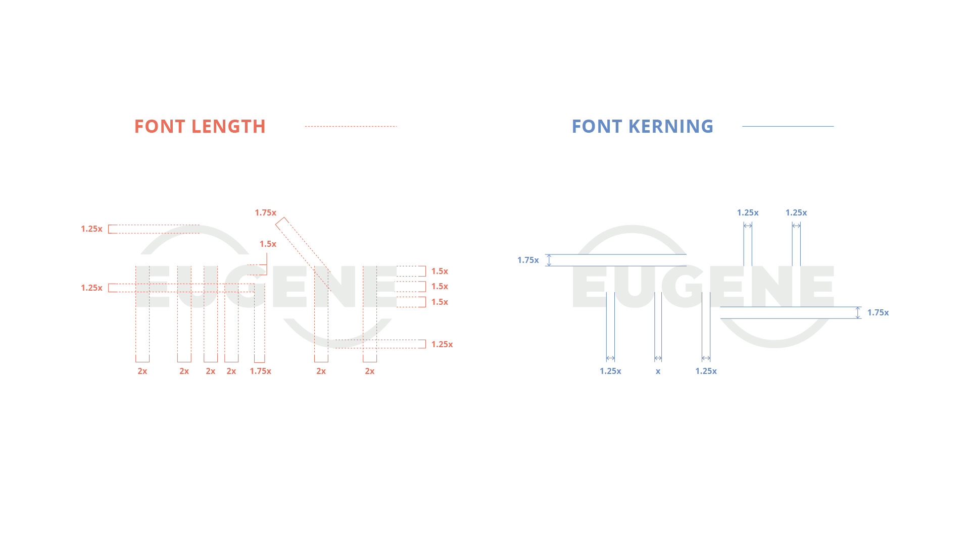
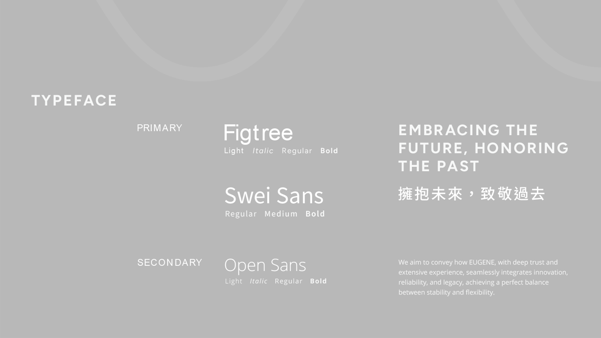
At the center of the identity is EUGENE’s iconic sine wave motif, representing technological strength and continuous progress. The extended lines convey flexibility and adaptability, symbolizing EUGENE’s role in connecting customers with advanced materials and emerging technologies. A modern, non-italic typeface reinforces a sense of stability and professionalism, while presenting a clean and contemporary appearance that aligns with the brand’s evolving direction.
CONSISTENT BRAND IMPLEMENTATION
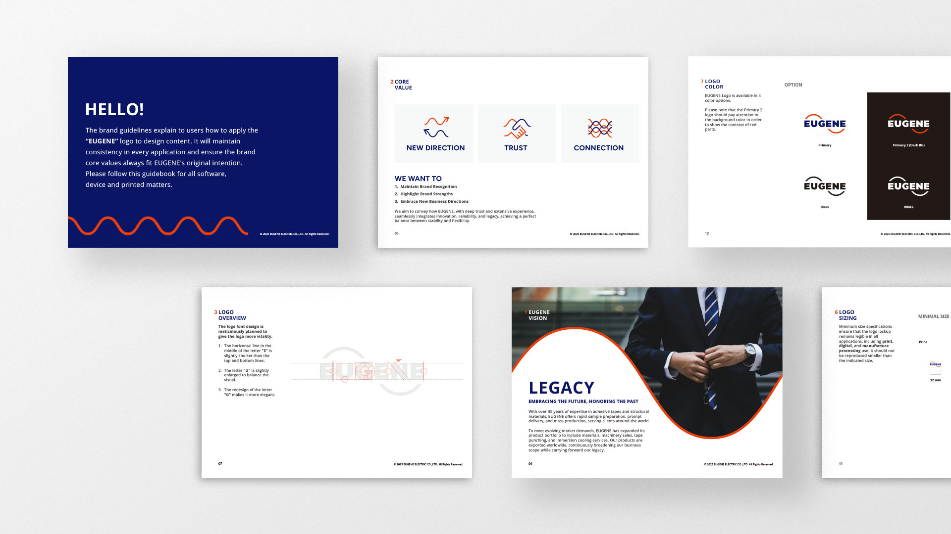
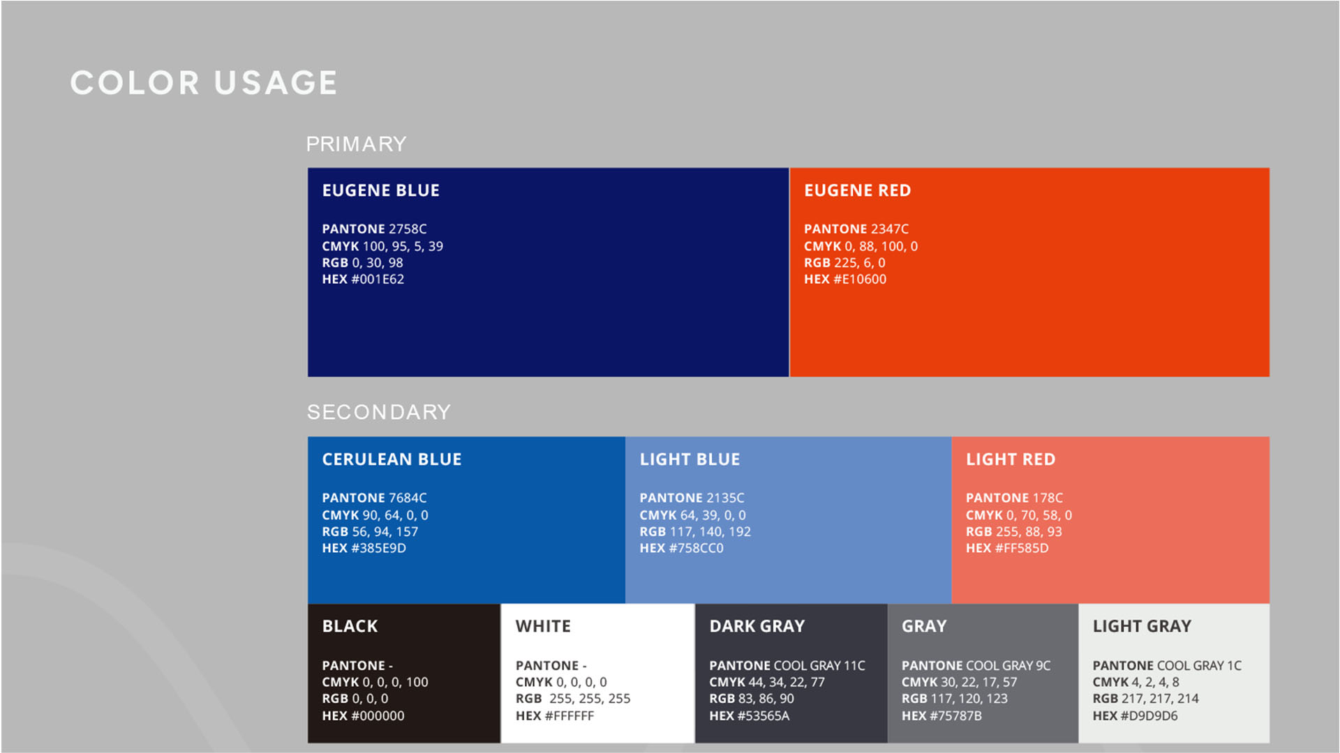
To ensure consistent implementation of the new identity, CRE8 developed a comprehensive brand guideline that defines how the logo should be applied across digital platforms, software interfaces, devices, and printed materials. The system adopts the corporate colors—deep blue, representing trust and stability, and vibrant red, symbolizing energy and innovation—to maintain a recognizable and unified brand presence while ensuring that every touchpoint reflects EUGENE’s commitment to quality.